Fabo
Not everything blooms
Flower shops usually look the same. Soft, feminine, gentle. Which is fine, but it ignores something a bit uncomfortable: most of the time, women are the ones reminding the people around them to buy flowers for them in the first place.
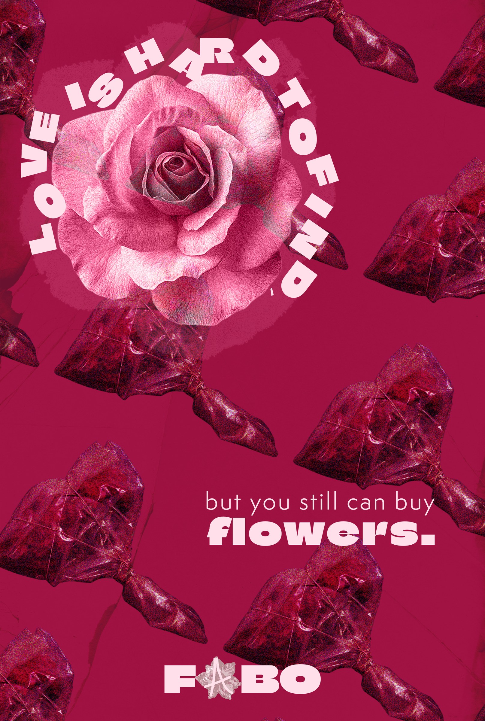
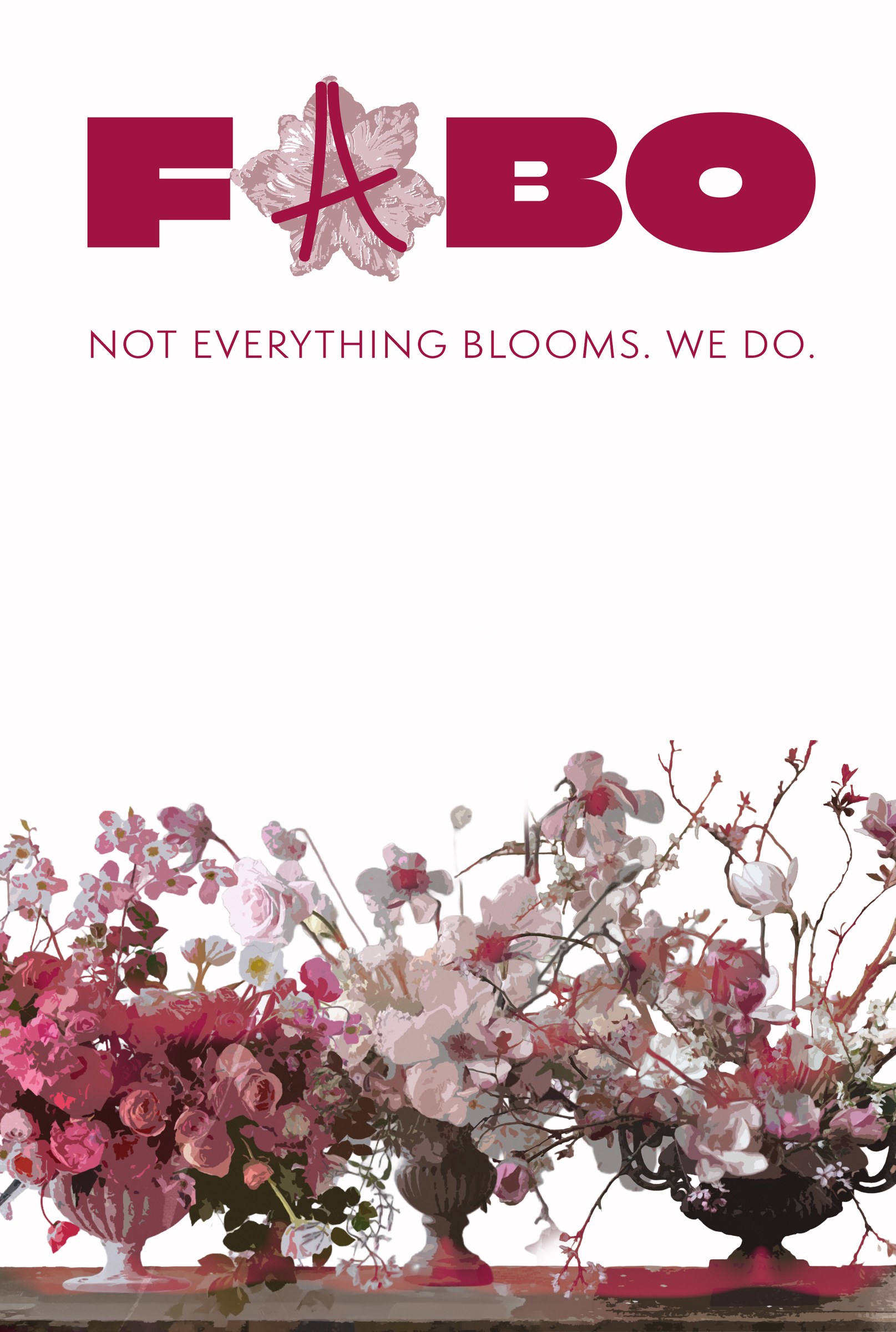
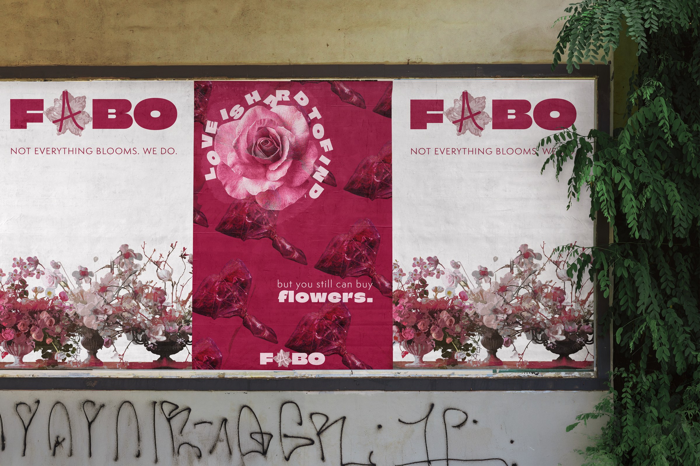
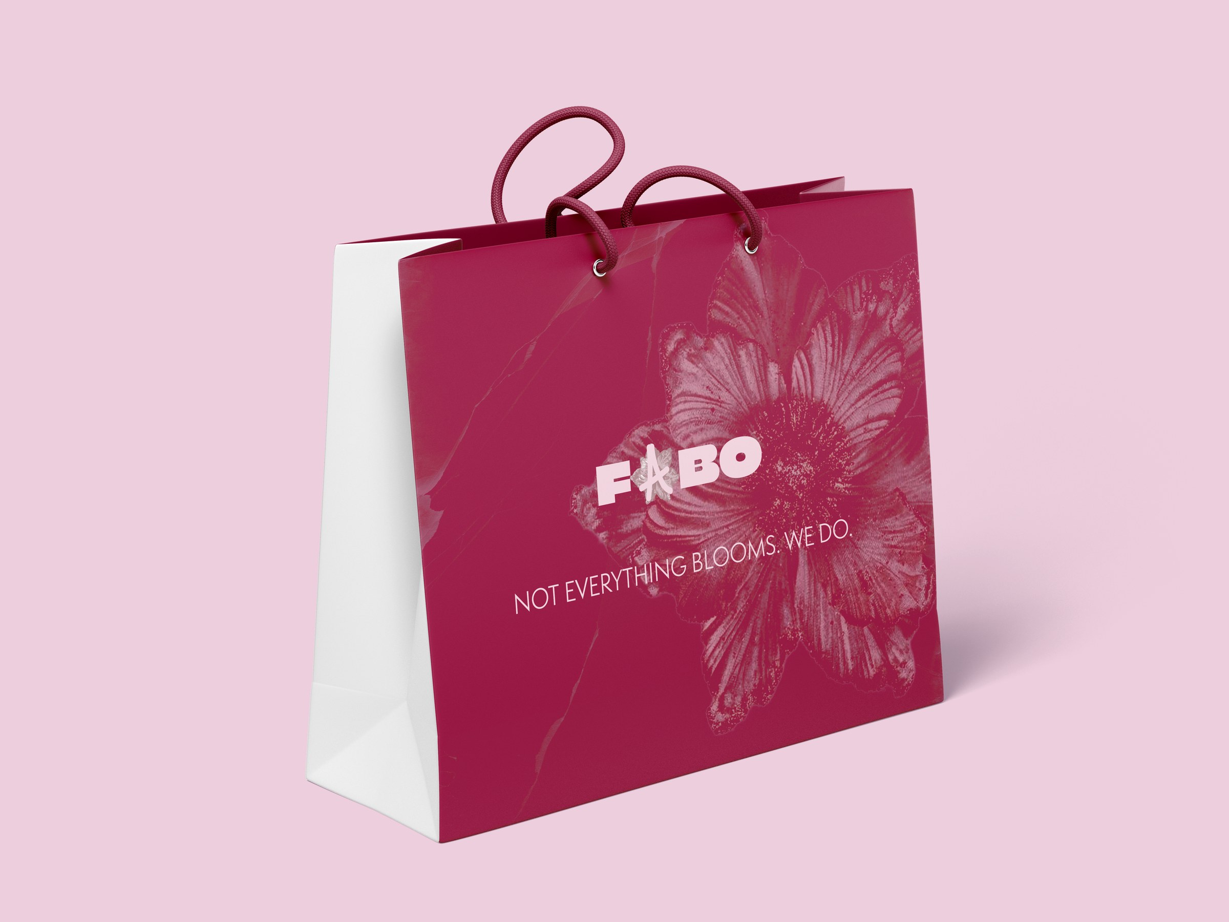
That tension became the brief. The brand doesn’t pretend it isn’t there. “Not everything blooms. We do.” – and on some pieces, more directly: “Love is hard to find, but you can still buy flowers.” It works as a nudge to whoever needs nudging, and as something quieter for someone who just wants to buy themselves flowers without making it a big deal.
The audience is 20 to 60+ years old men and women. The brand needed to be strong enough to stop people on the street but warm enough that it doesn’t feel cold or ironic.
Key decisions
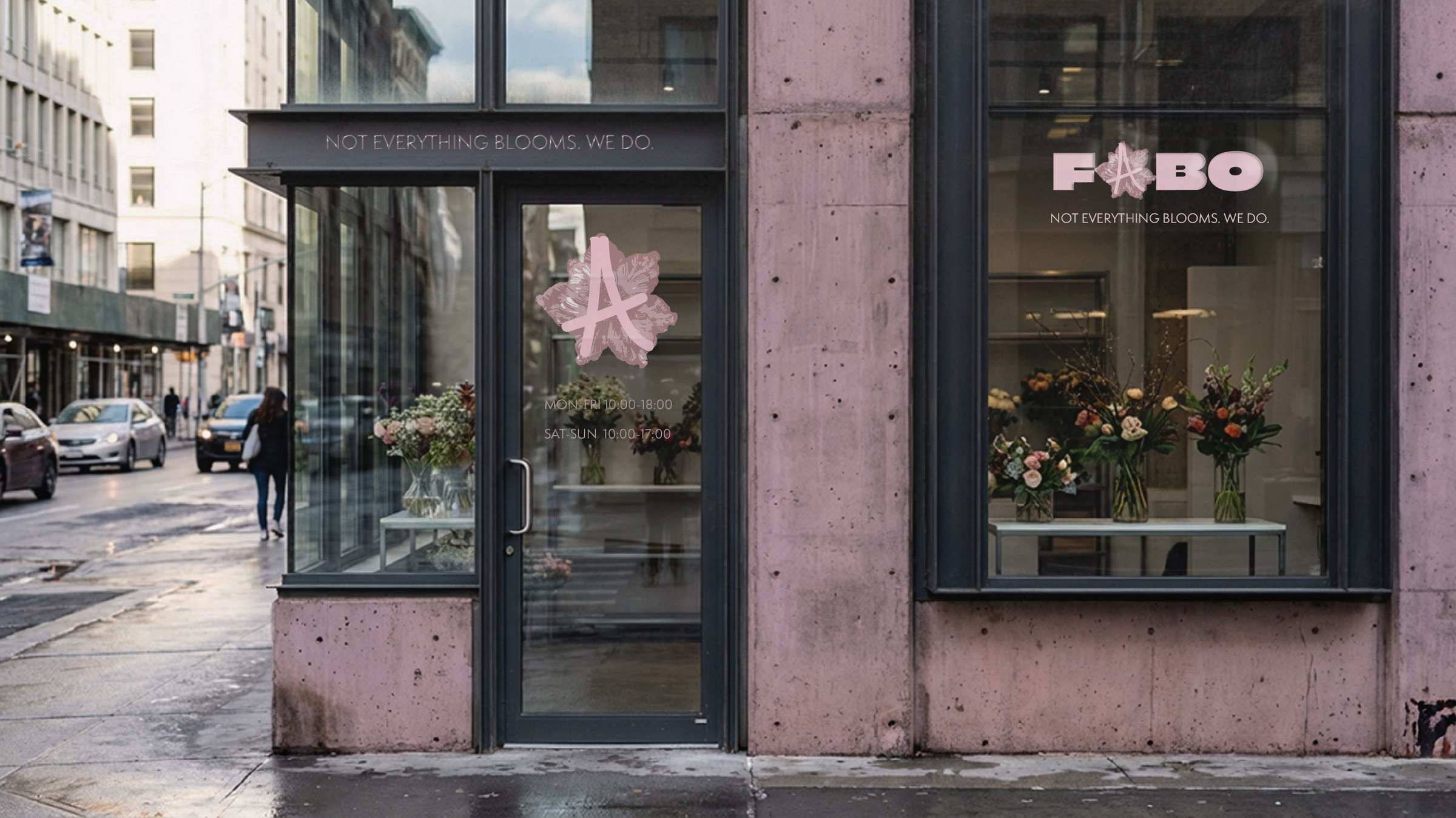
- The tagline“Not everything blooms. We do.” sets the tone for everything else. A little sharp, a little honest. The secondary copy on billboards and packaging pushes it further depending on context.
- Magenta and light pinkThe contrast between a strong magenta and a soft pink mirrors the same tension as the concept. Nothing here is purely delicate or purely bold – it sits between both.
- The logoStrong wordmark, but the A is replaced with a flower. One small detail that softens the whole thing without making it decorative. The contrast between the heavy letterforms and that one fragile element is the brand in miniature.
- Applied across surfacesThe identity needed to work on a billboard and on a business card. The same tension that’s in the concept had to survive at every scale: storefront, packaging, app, print.
Self-initiated concept.
Next project
Have a brand that should feel like something?
Start a project →