Mizu
Demons at the Table
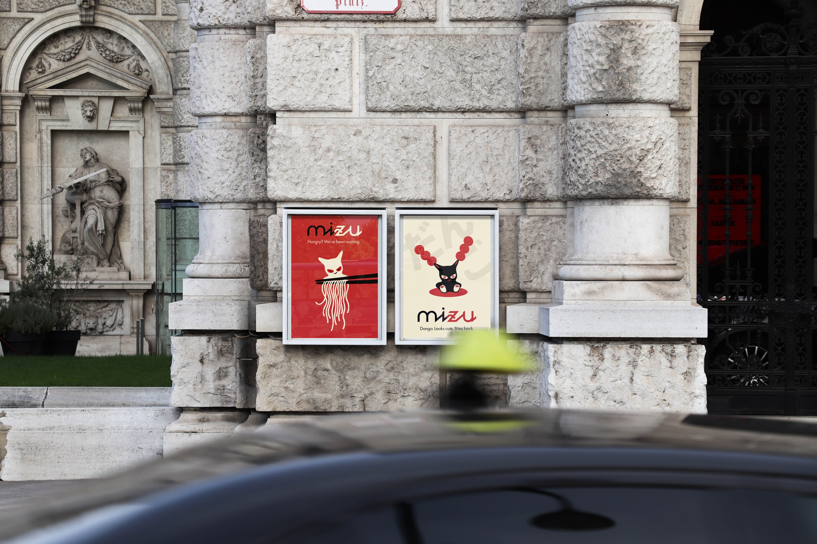
Walking around Vienna, I kept noticing how few places actually invest in how they look. Not just a logo on the door – but a real visual world you step into. That gap felt like a brief worth answering.
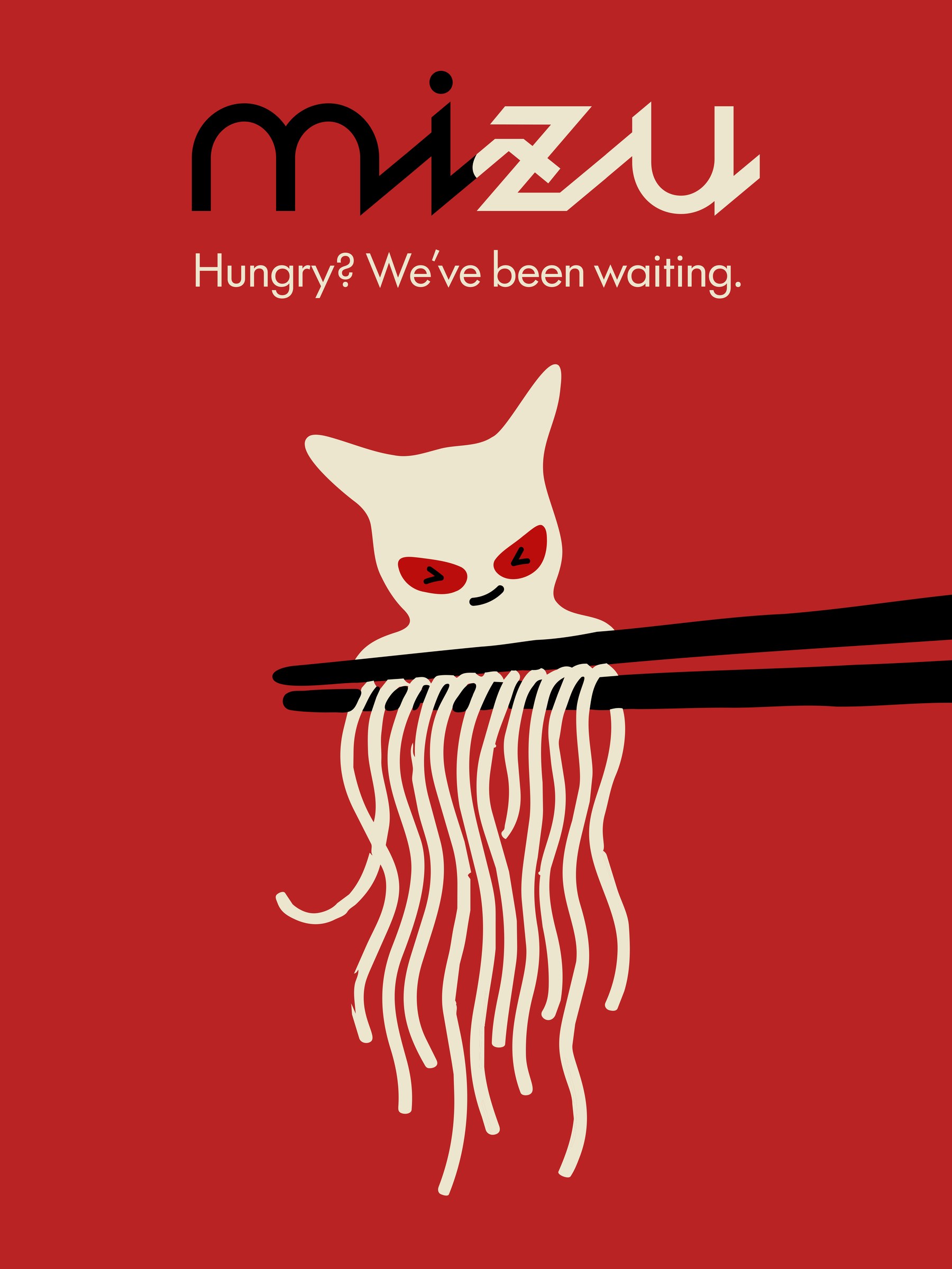
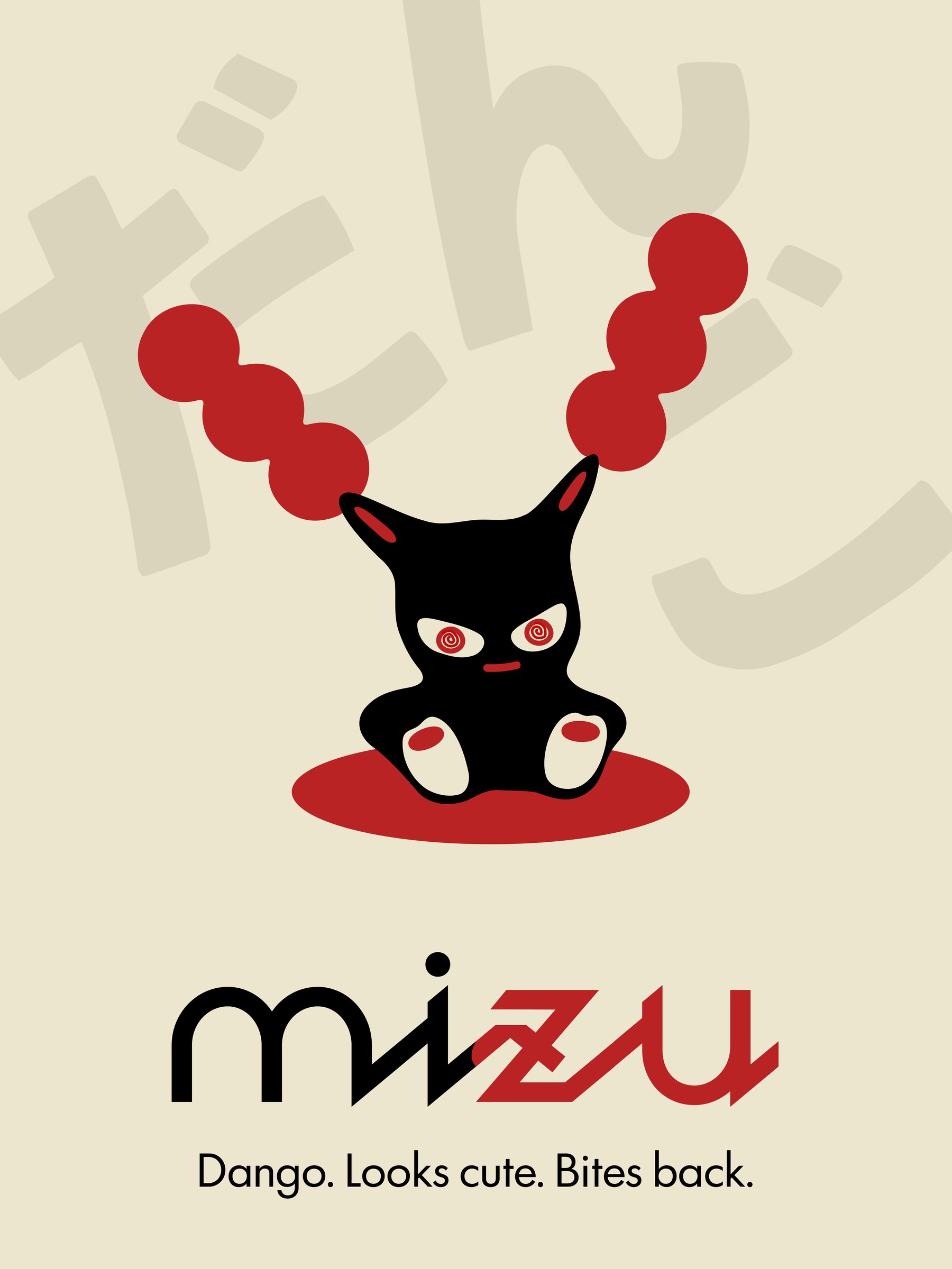
The concept came from Japanese folklore. Oni – the horned demons of Shinto tradition – aren’t just scary. In many traditions they protect as much as they threaten. That contradiction felt right for a restaurant: something with an edge that still makes you want to come in.
The restaurant was imagined for young people and families in Vienna, 16 to 40. Somewhere that feels alive and a bit unpredictable, not another minimalist café. The brand needed a personality, not just a palette.
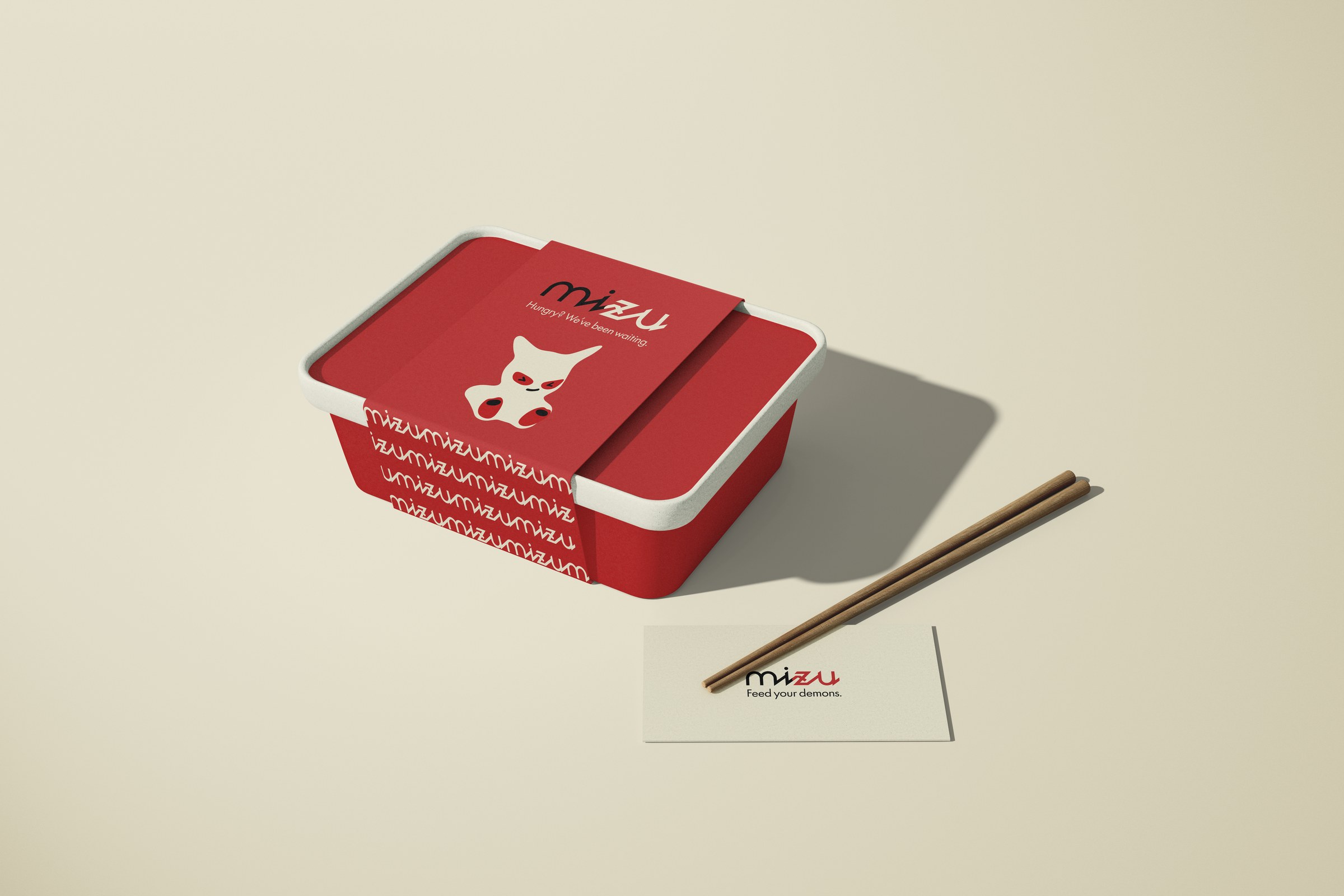
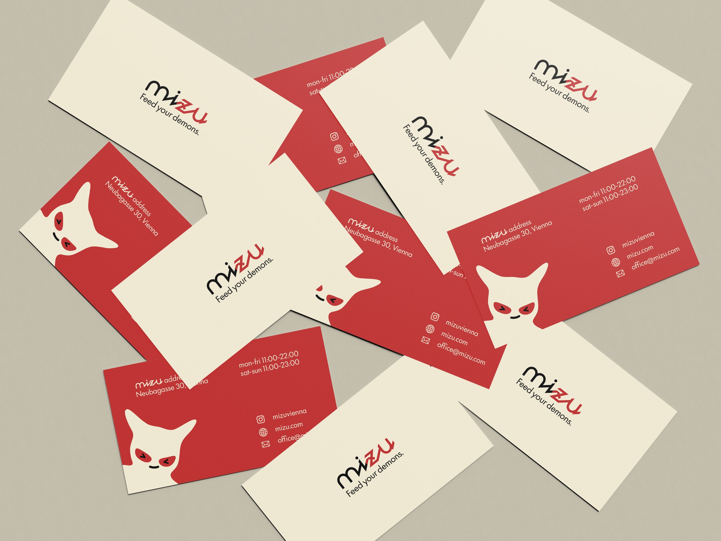
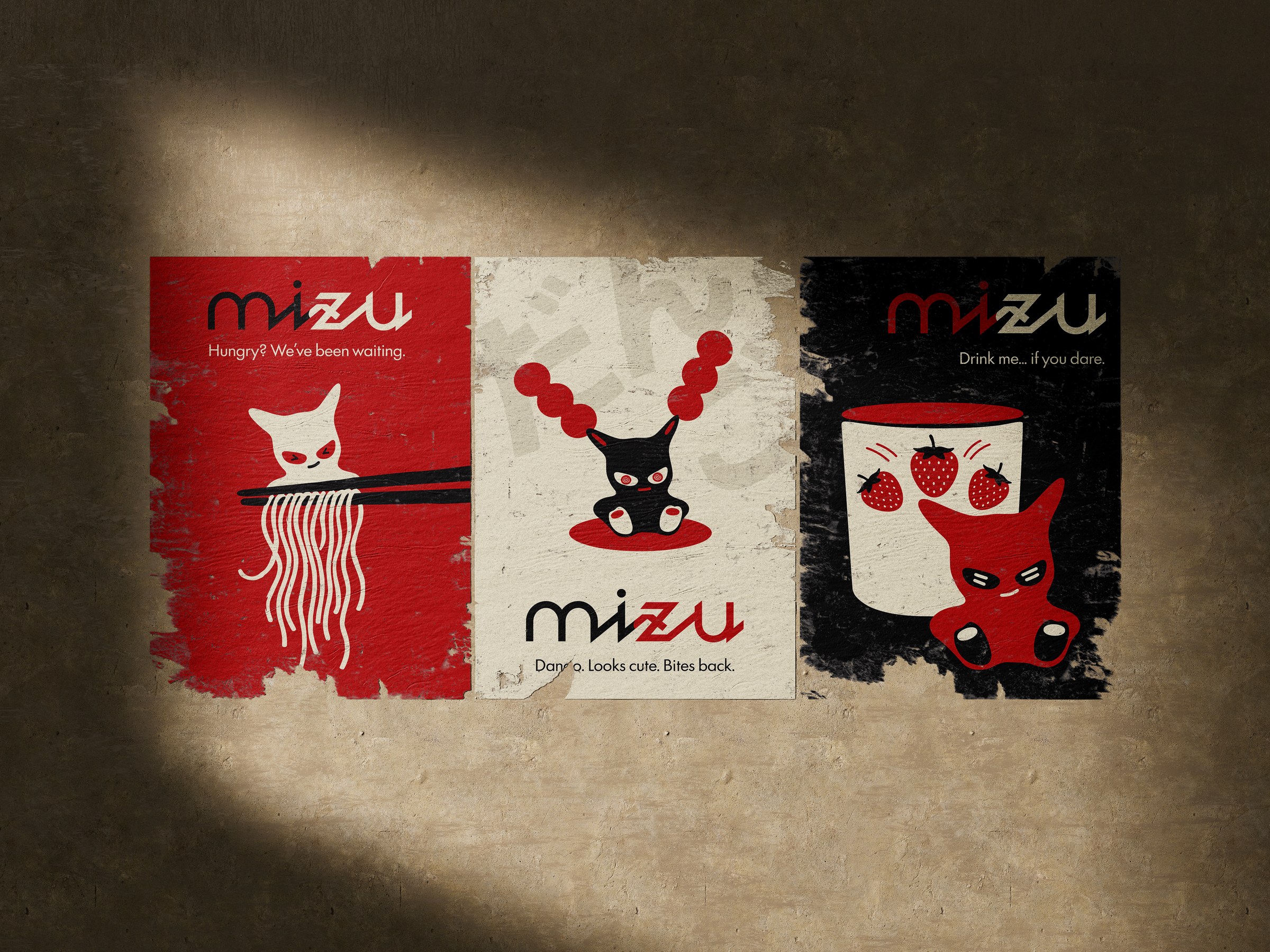
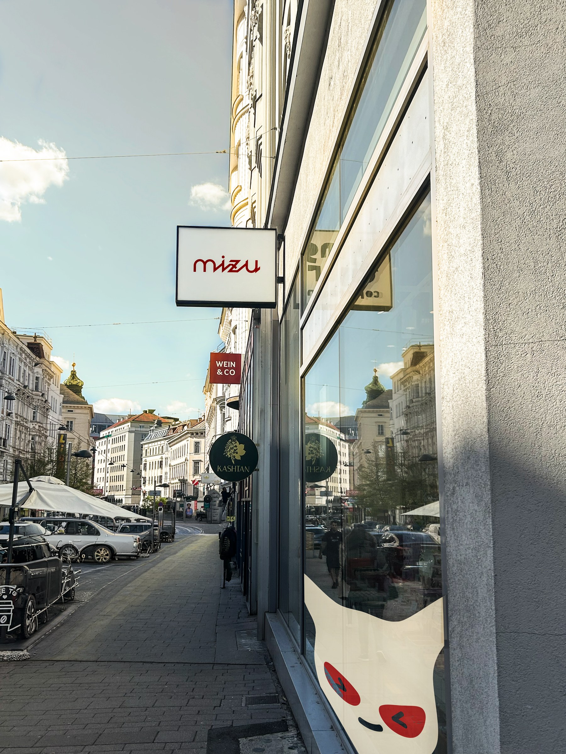
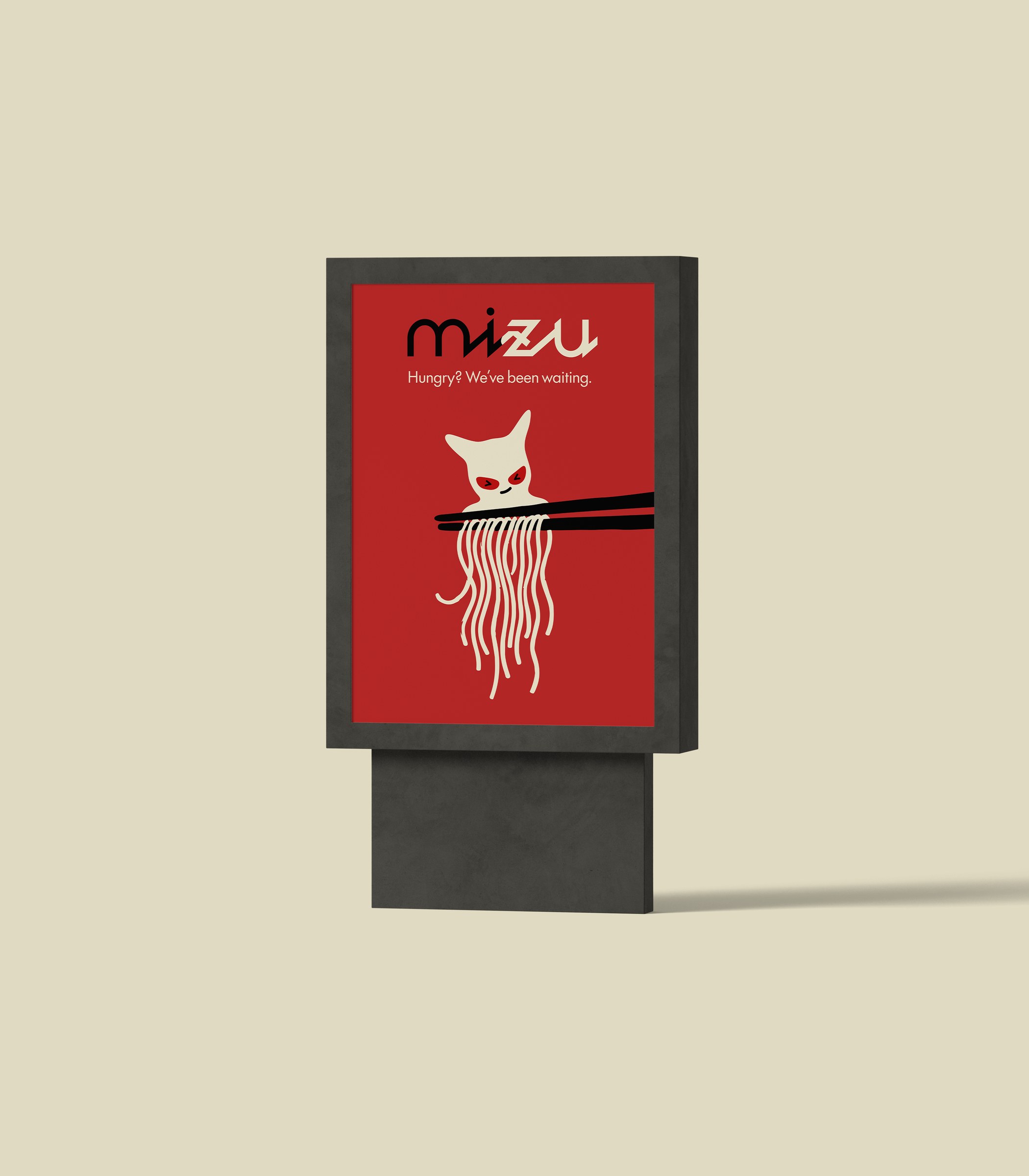
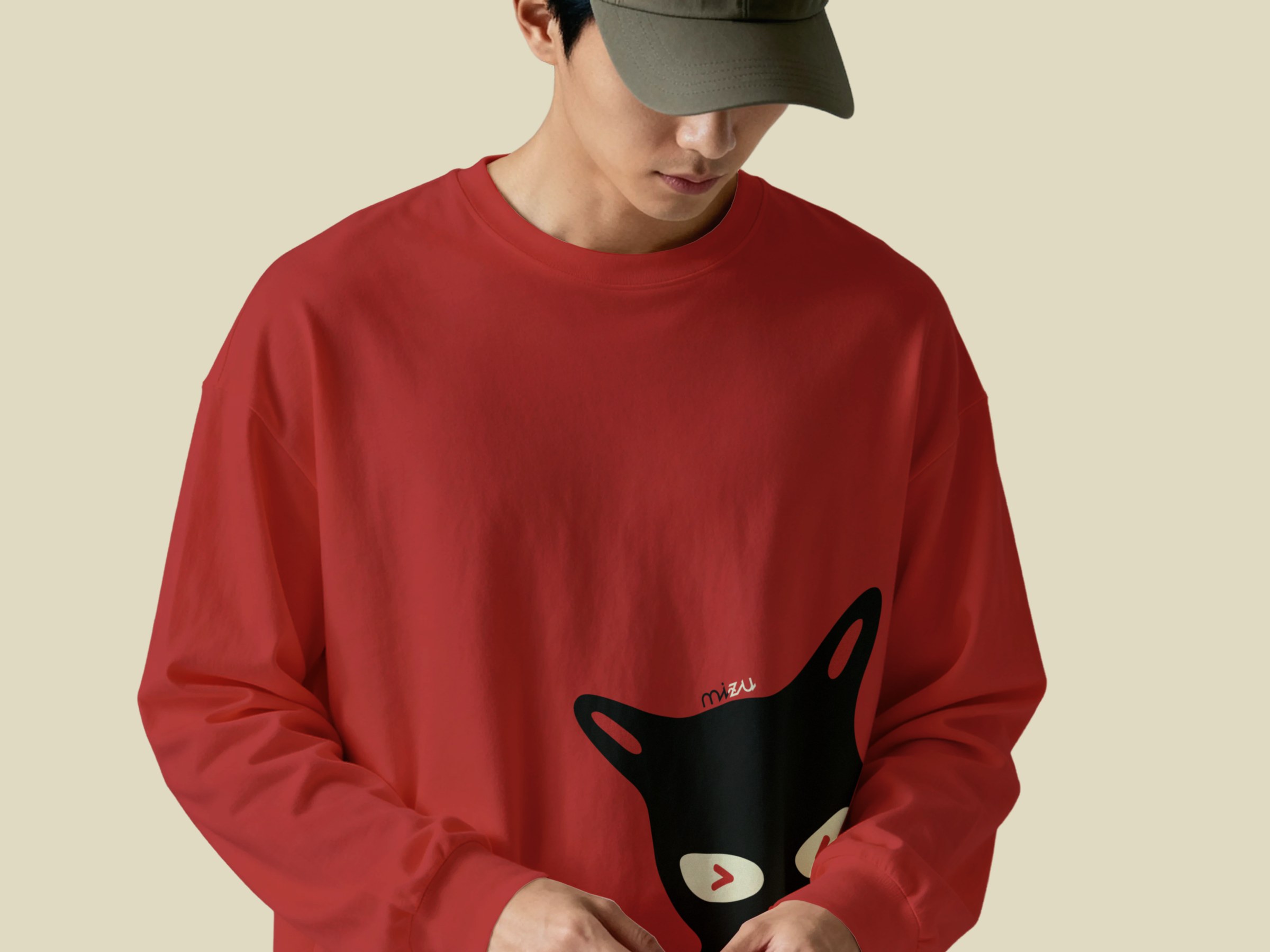
To see how it would actually live in the world, I photographed locations around Vienna and built mockups from them. The animation was made to match the same energy as the rest of the system.
Key decisions
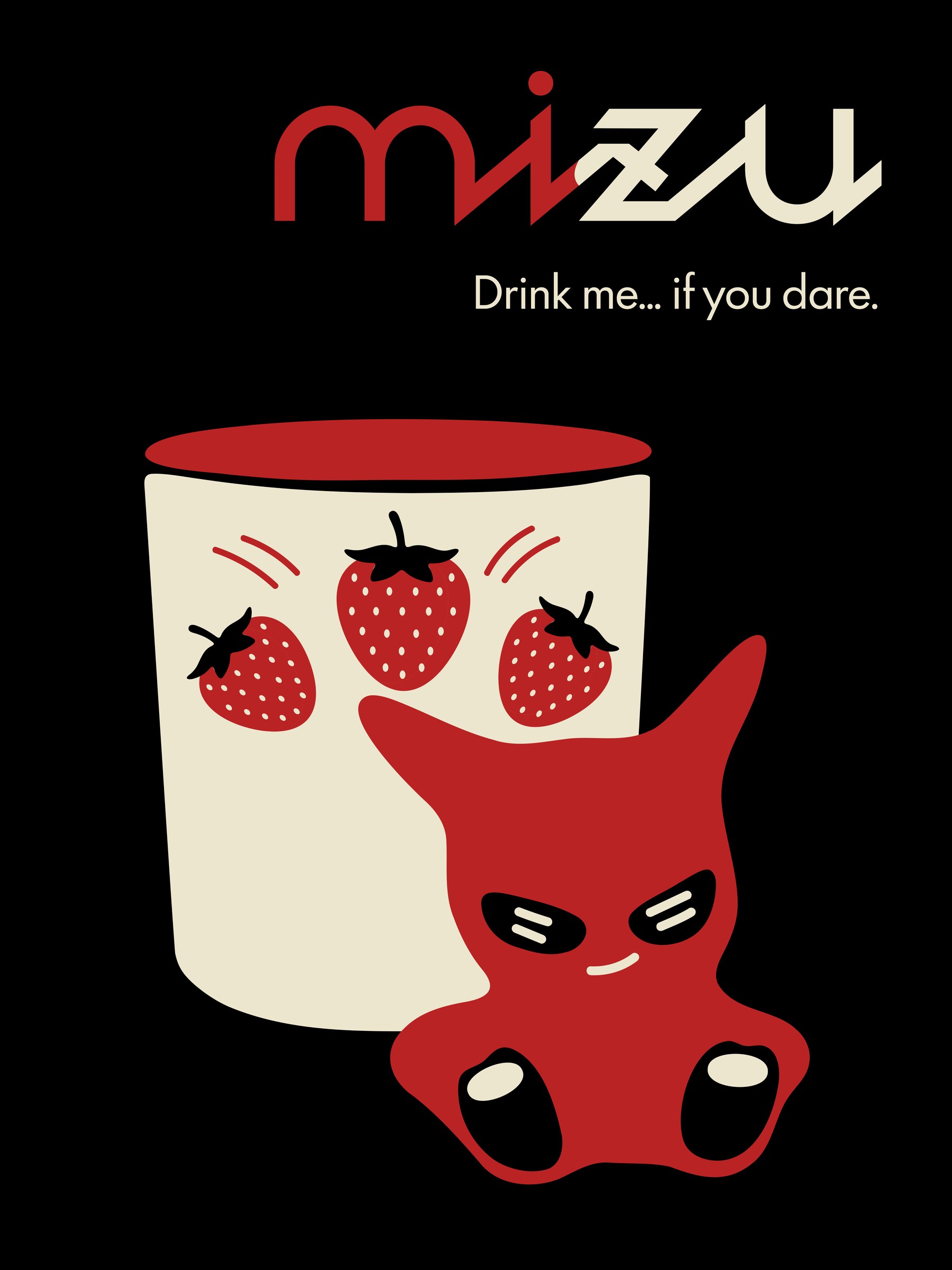
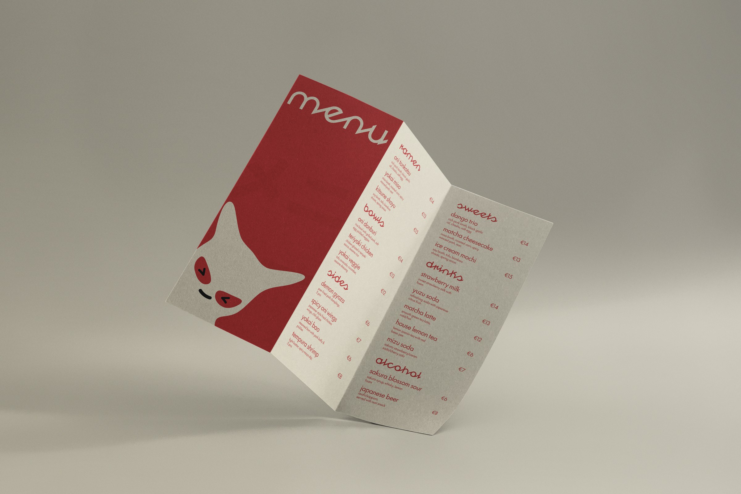
- The mascotDrawn directly in Illustrator. Several versions, same goal – land somewhere between threatening and friendly. The final one kept the horns and the expression but softened the body enough that it pulls you in rather than pushes you away.
- RedOni are red-skinned. In Japanese visual culture it carries urgency and energy. It’s also just the color that makes you stop and look.
- Black and creamBlack keeps the brand from tipping into something too cute. Cream makes the whole thing warmer and more approachable.
- Pattern over logoRepeating the mascot across cans, merch, menus and the storefront turns a character into an environment. The brand feels like somewhere you’re inside, not just something you walked past.
Self-initiated concept. Not affiliated with any existing restaurant.
Next project
Have a brand that should feel like something?
Start a project →